
Make a Polar Plot
The Polar Plot Plugin is a powerful tool in KeepTrack.Space that allows you to visualize a satellite’s path across the sky from a specific sensor’s perspective. This 2D representation is particularly useful for understanding satellite passes and planning observations.
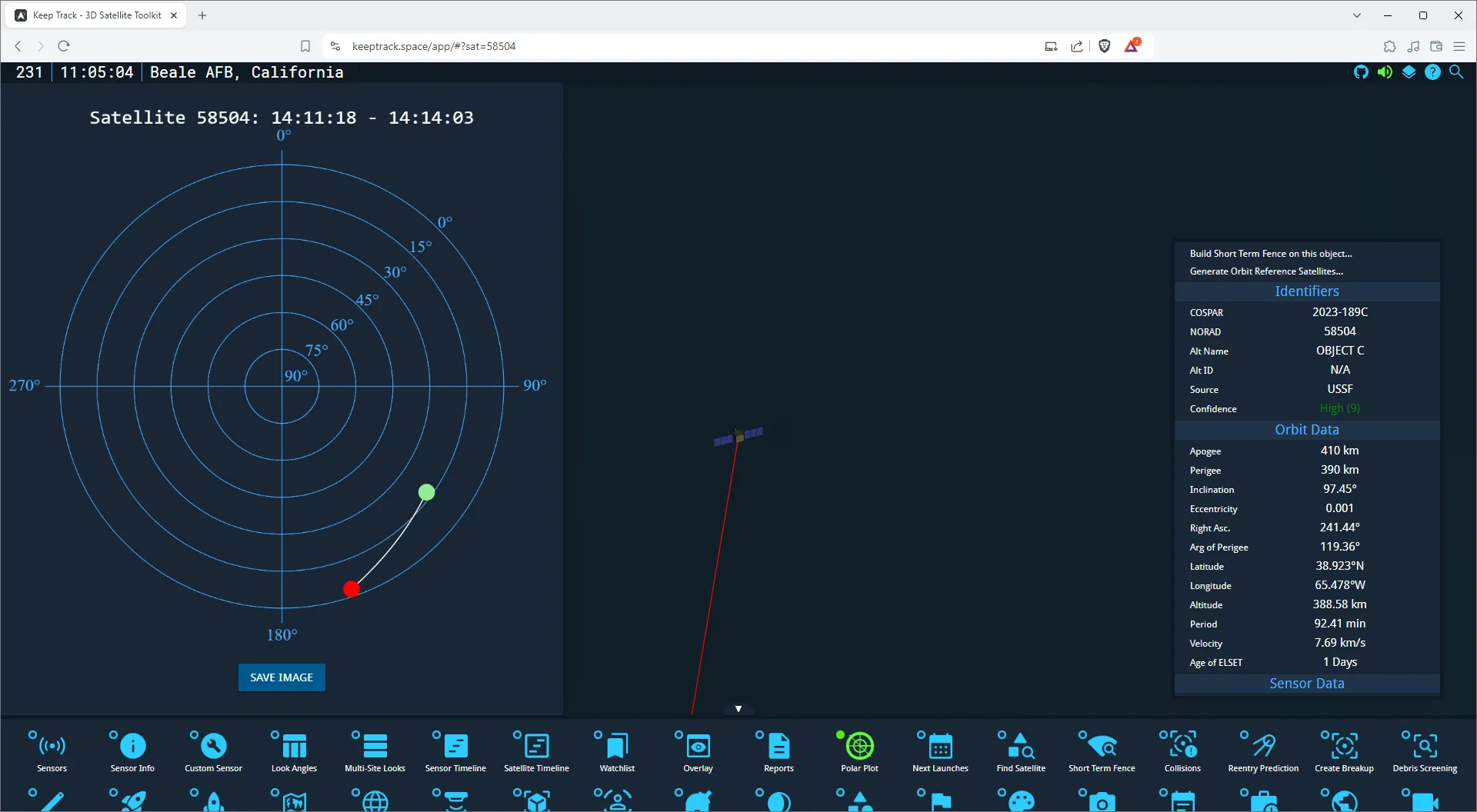
What is a Polar Plot?
A polar plot in satellite tracking represents:
- Azimuth: The horizontal angle from North (0-360 degrees), shown as the angle around the circle
- Elevation: The angle above the horizon (0-90 degrees), shown as the distance from the center of the circle
- Time: Represented by the progression of the line on the plot
Using the Polar Plot Plugin
-
Select a Sensor and Satellite:
- Choose a sensor using the Sensor List
- Select a satellite using the search function
-
Open the Polar Plot Plugin:
- Find the “Polar Plot” icon in the bottom menu (it looks like a polar graph)
- Click on this icon to open the Polar Plot side menu
-
View the Polar Plot:
- The plot will automatically generate for the next visible pass of the satellite
- The line on the plot shows the satellite’s path across the sky
- Green dot: Start of the pass
- Red dot: End of the pass
-
Interpret the Plot:
- Follow the line from the green dot to the red dot to see the satellite’s movement
- The closer to the center, the higher the satellite’s elevation
- The angle around the circle shows the azimuth (compass direction)
-
Save the Plot (Optional):
- Click the “Save Image” button below the plot
- The plot will be saved as a PNG file on your device
Example: Creating a Polar Plot for the ISS
Let’s create a polar plot for the International Space Station (ISS) from a specific ground station:
- Select the Eglin radar sensor (or any other sensor of your choice)
- Search for and select the ISS (ZARYA) satellite
- Open the Polar Plot plugin
- Observe the generated plot showing the next ISS pass
- Notice the start time and end time of the pass displayed at the top of the plot
Understanding the Plot
- The concentric circles represent elevation angles (15°, 30°, 45°, 60°, 75°, 90°)
- The radial lines represent azimuth angles (0°, 90°, 180°, 270°)
- The satellite’s path is shown as a white line
- The green dot shows where the satellite first becomes visible
- The red dot shows where the satellite disappears from view
Practice Exercise
Try creating polar plots for these scenarios:
- A GPS satellite from the NESS (GEODSS) sensor in Diego Garcia
- The Hubble Space Telescope from Fylingdales (SSPAR) in the UK
- A geostationary satellite (e.g., GOES 16) from Millstone (Haystack) in Massachusetts
Compare the plots and notice how different orbits create different patterns.
By mastering the Polar Plot plugin, you’re gaining a powerful tool for visualizing satellite passes. This can be incredibly useful for planning observations, understanding satellite visibility patterns, and communicating pass information to others.